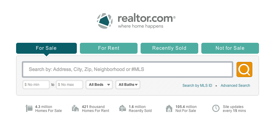
In a complete overhaul of one of the largest real estate search sites in the nation, realtor.com has not only rolled out a new website, but also a new logo, tagline and color scheme. With the rebranding of realtor.com, the company is asserting that it is not an outdated real estate search giant, and deserves to be a finalist at the 2013 Appy Awards, standing tall as a technology company rather than a stuffy Realtors organization. The modern look gives the brand some much needed energy, and with the clever logo of streets converging to form a house, realtor.com has a shot at broadening its appeal.
“As we heighten our focus on developing a rich consumer experience and creating an emotional attachment to our audience, we recognized that it was time to update our realtor.com branding, positioning and tagline,” said Andrew Strickman, vice president of brand and creative at realtor.com. “We conducted extensive research and spoke with consumers from across the country as key input to the development of our revised logo and new site look and feel. We heard from them that a valued online real estate brand is one that embraces the notion of home – whether that home is their first rental out of college, or the three-bedroom house that marks the beginning of a new family growing out of their starter home.”
“Most online real estate brands feel clinical, data- and machine-driven and do not have a human feel, even though they are all about creating connections with real human beings,” Strickman added. “Our role with this rebranding effort and graphic iconography, which represents home in the center of a community (‘all roads lead home’) is to draw a much stronger connection between realtor.com and the people that fuel its service, both consumers and Realtors.”
Why Ditch the Traditional Blue?
The company says that the teal color selected represents credibility, authority and leadership. Teal conveys a feeling of security and is often identified with money and prestige.
“Teal is one of the new Web colors that is emerging as a differentiator from the Facebook and Twitter blues that are everywhere,” said Dave Arnold, executive creative director at Pereira & O’Dell, a San Francisco-based advertising agency. “Pantone has made emerald the color of the year for 2013, so I’m sure we will be seeing a lot of variations in the blue/green world.”
Color stimulates emotion, Arnold noted. “I think a blend between blue and green, or teal is a smart one for realtor.com,” he said. “Green symbolizes nature, environment and money – all great takeaways for the brand. It’s also a calming color, which for some can be much needed when house hunting.”
Is The Letter “R” Really Okay Lowercase?
Upon release of the rebrand, various agents objected, noting that “Realtor” is a trademark of the National Association of Realtors, which has an operating agreement with Move, Inc. (parent company of realtor.com) in place. Some noted that the use of the word “Realtor” is meant to be capitalized, while others stated via social networks that the word should always be in all caps with a trademark logo.
Regardless of past use, a trademark was filed by the National Association of Realtors on Feb. 6, 2013 not only on the new realtor.com logo, but on the words and letters used in the logo (meaning the tagline along with the specific spelling of “realtor”).
While there may be chatter between industry professionals, the lowercase “r” and typography of the new logo, along with the design, tagline and color scheme, bring the brand into a modern era, and its minimalism could give it a stronger chance of being timeless, as many of its competitors remain firmly rooted in the aesthetics before 2006.

